
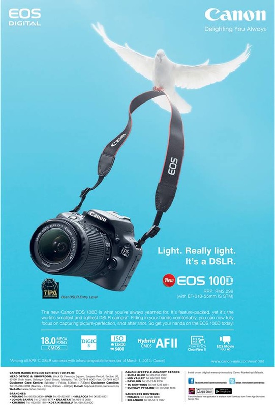
This is an ad for the new EOS 100D by Canon Malaysia, highlighting the product's lightweight feature with the headline "Light. Really light. It's a DSLR." The ad is heavier in body copy and uses only the minimal visual of a bird carrying a camera.
This ad has an asymmetrical balance, with a focal point on the bottom left side where the camera lies. Viewers' line of vision will be directed from the camera following the camera strap to the top where the bird is flying, creating movement in the design. With that, viewers will realise that the proportion of the bird and the camera are realistic, thus it is relatable to the headline emphasizing the lightweight benefit of the camera.
The background colour of this ad is light blue, hence it serves as an attention-grabbing element. Other elements are in black and white atop the bright background, so one can clearly differentiate the figure and ground, providing contrast to the design. Related elements are placed in close proximity, for example all text in the ad is gathered at the bottom of the ad. This creates a contrast in space (light visual vs. heavy text) when comparing the top and bottom part of the ad.
Repetition is evident in this ad's design, whereby majority of the font type used is the same throughout the ad. The colour of the text is also either white or black, so people can easily tell that the white text is information on the product, whereas the black text is information on the company and brand.
Conclusion:
This ad catches attention quite well because of its bright colour. The visual is pretty creative and speaks the message well, especially when accompanied with the headline. Basically it can be considered a fairly good ad.


 RSS Feed